
Five & Ten
* BRAND IDENTITY } ILLUSTRATION = Packaging
Five & Ten is an upscale restaurant located in the heart of Five Points. Established over 25 years ago, the restaurant recently took on new ownership. Peter Dale, the mind behind Athens favorites like Condor Chocolates, Maepole, the National, and Seabear, decided to come back to the restaurant
that gave him his start in the restaurant world years ago. His love of Five & Ten and for the Athens community were obvious from our first meeting, and we worked together to bring the look of the brand up to par with Peter’s goals and perceptions of the restaurant.

History
When we first began our work with Five & Ten, we had few assets to work from and a huge vision to help elevate diners’ experiences. In years of leadership turnover, the brand became a little disjointed as it grew and changed. We didn’t want to alienate loyal customers from the restaurant they have loved for so long, but a
change was also needed to bring in new diners to appreciate Five & Ten’s creative twists on classic dishes. Our strategy was to build something that reflected the experience of dining at Five & Ten - elevated yet personal, innovative yet familiar.

Story
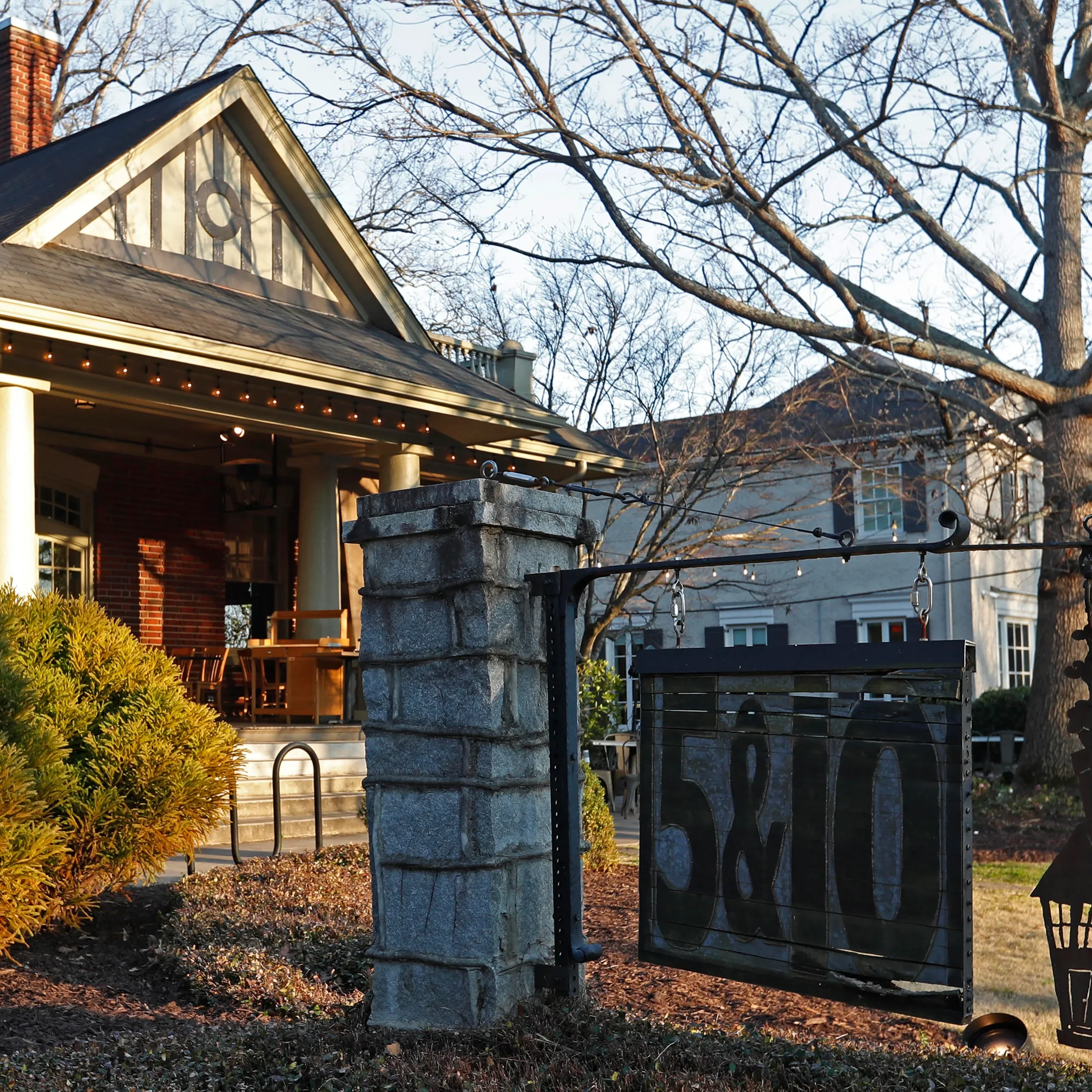
The restaurant sits in a historic home on Milledge Avenue. As we dove deeper into the story of Five & Ten, we discovered that their location was once the home of Ruth M. Jackson, a woman who was known to have lived alone but to have always dined with company. Her willingness to open her doors and share a meal with friends, family, and acquaintances
was well known. The spirit of hospitality is built into the very structure of the restaurant, and Ruth’s story encapsulated the spirit that we wanted to capture with Five & Ten - the memory of sitting around a table with people you love and sharing a good meal.

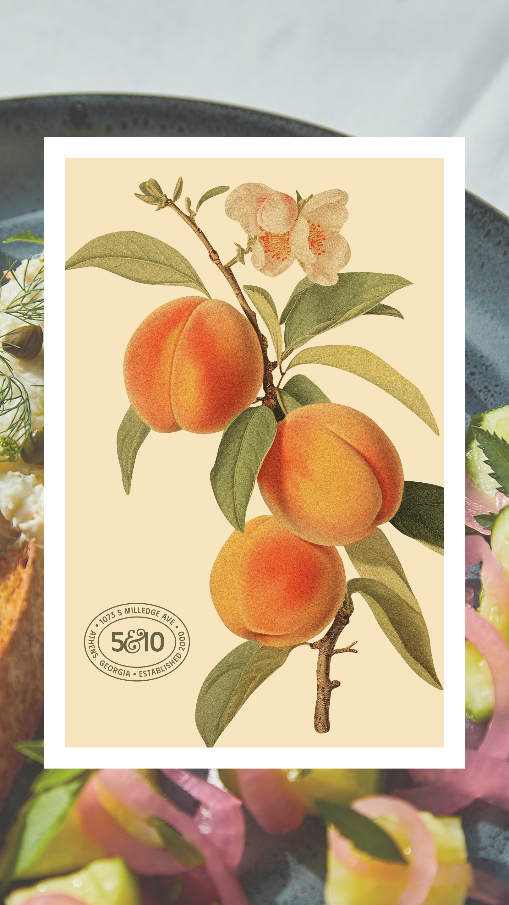
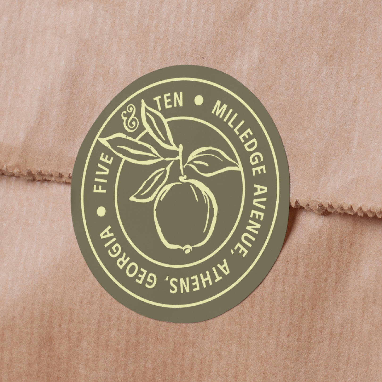
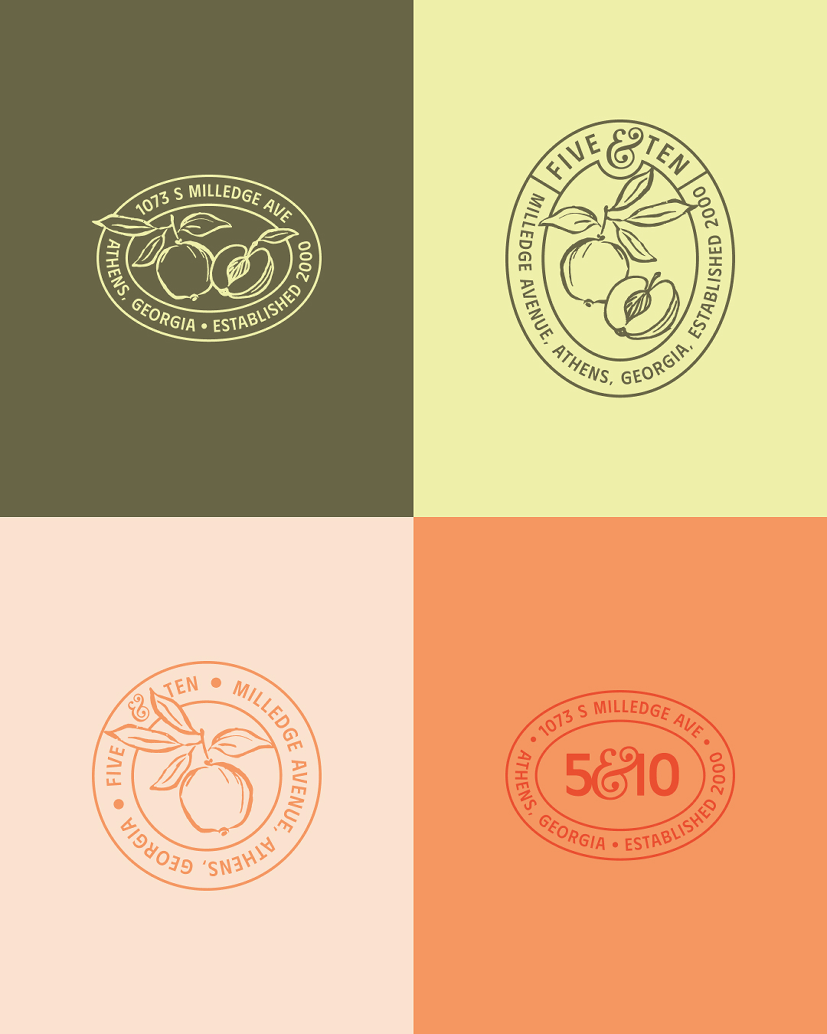
Visual Brand
As we began to work on the visual brand for Five & Ten, we explored color and typography that felt nostalgic but modern. Dusty greens and yellows paired with a vivid tomato red and peach create a color palette that is unique but also reflects the colors seen in the
restaurant’s dishes and cocktails.
For typography, we paired two hand drawn fonts with a delicate italic.


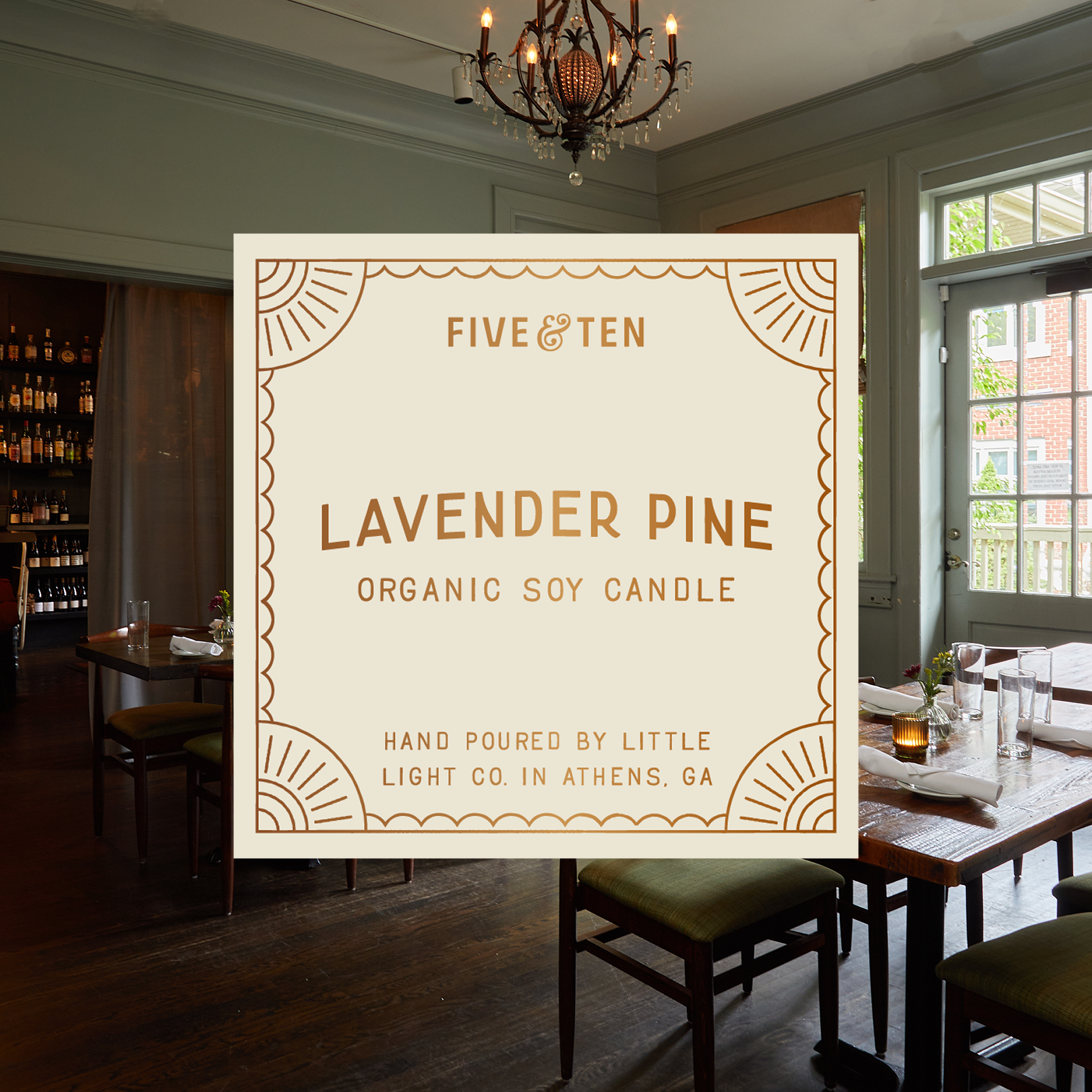
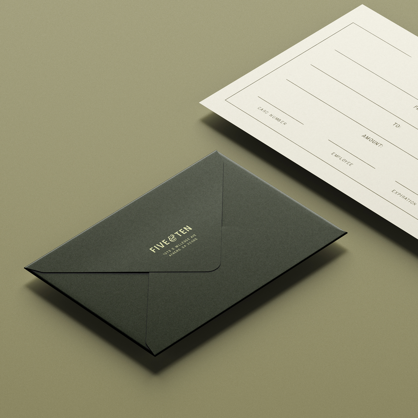
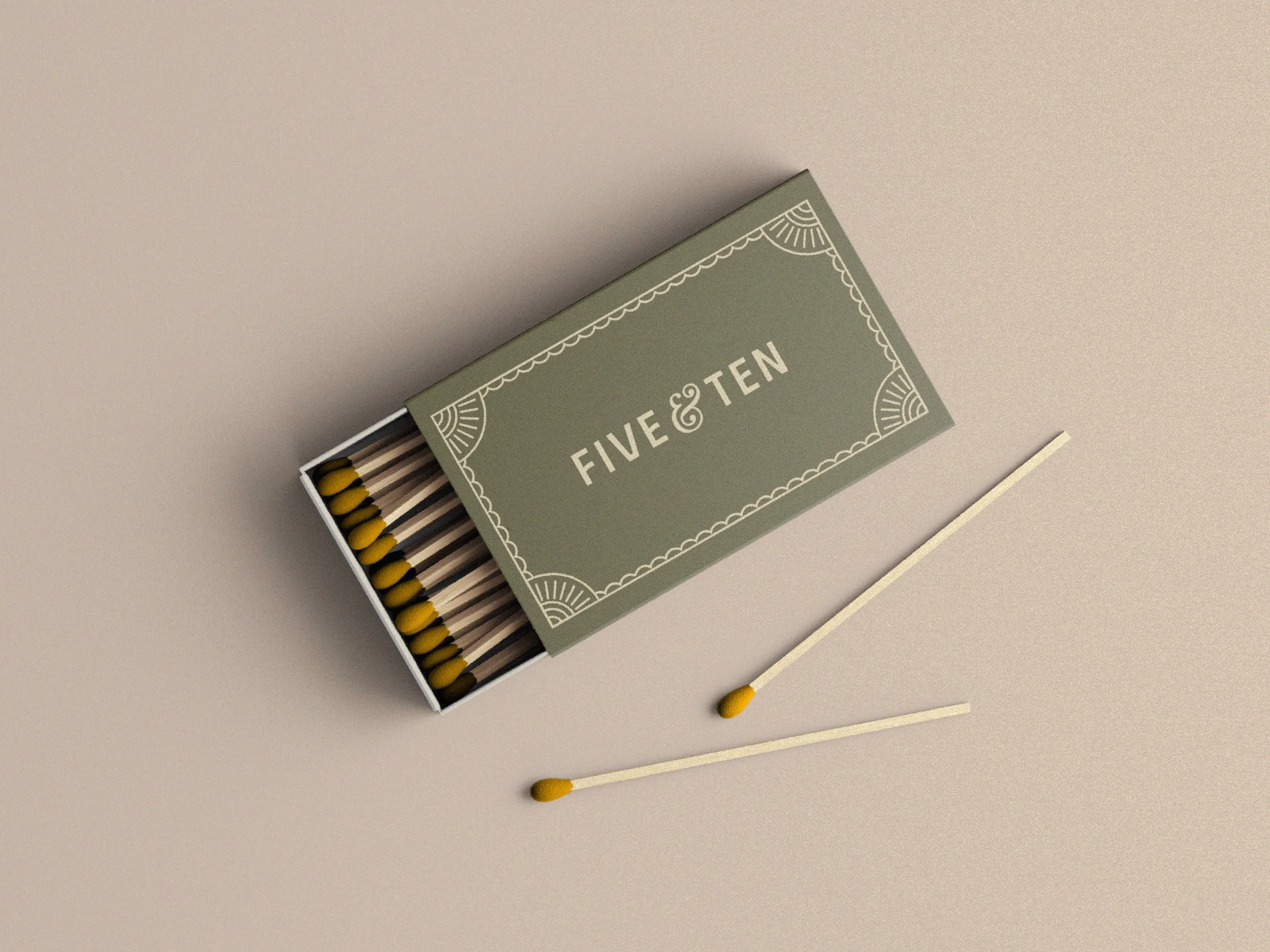
Part of our approach to the rebrand was to capture the nostalgia of a good meal shared in a physical manner. In a world shifting to digital, a touchable takeaway is even more treasured.
On top of their staff’s efforts to make every diner’s experience special, custom matchboxes, nice coasters, a take home postcard, and customized cards for birthdays and anniversaries help ensure
that diners feel celebrated and get to take home a physical memory of their dining experience.
Carefully selected paper, print finishes, and personalized details make every piece of the experience memorable and luxurious.

All interior, food, and cocktail photos shown are thanks to Daniel Dent.