MountainTrue
* BRAND IDENTITY } ILLUSTRATION # WEBSITE DESIGN
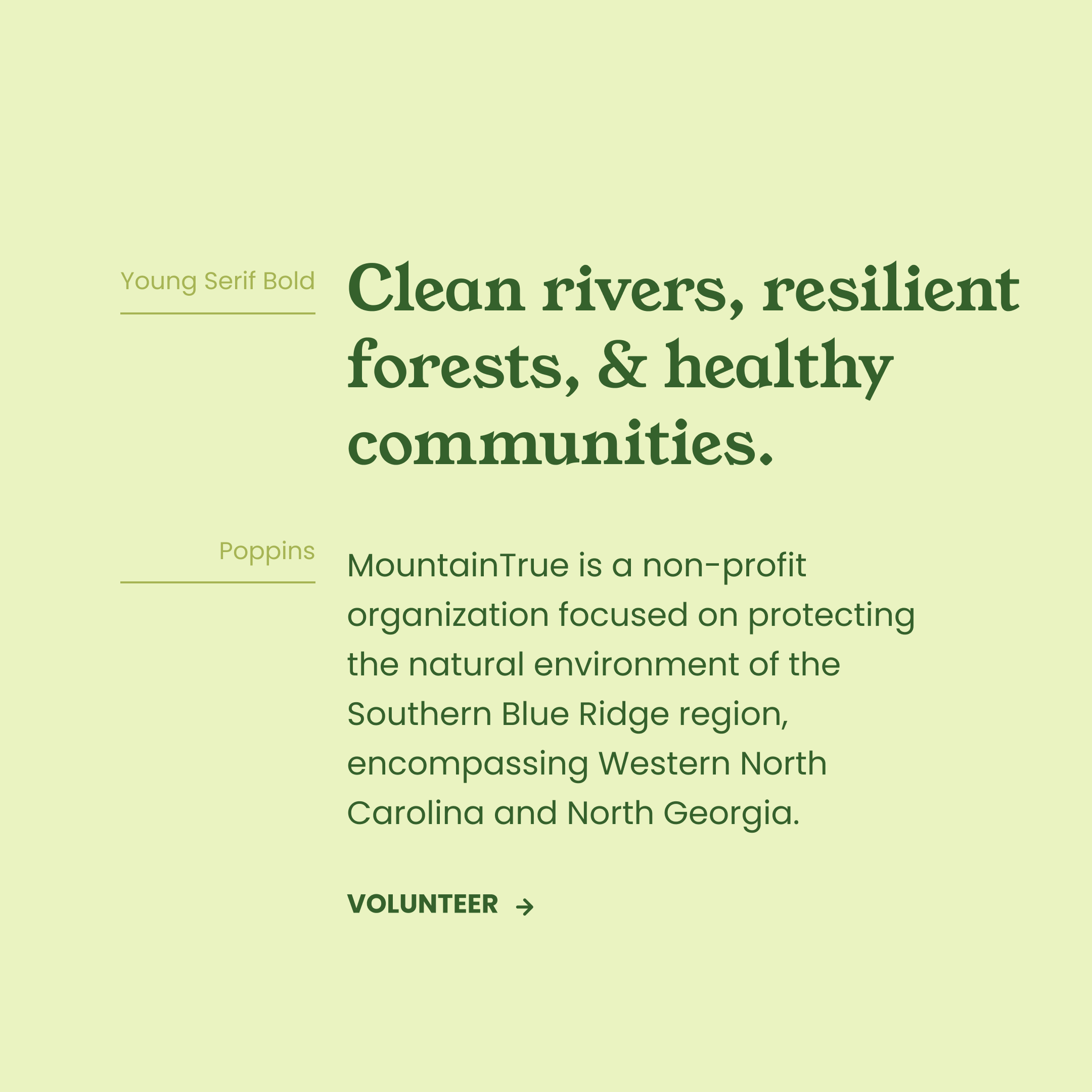
MountainTrue is a grassroots environmental nonprofit that champions resilient forests, clean waters, and healthy communities in the Southern Blue Ridge Mountains. As they grew, their brand adapted to reflect their desire to be seen as a professional and trustworthy organization.
Now, after 40 years of serving Western North Carolina, MountainTrue has stepped back to take a look at their brand. We focused on what keeps them going and making a difference in their community – their people.

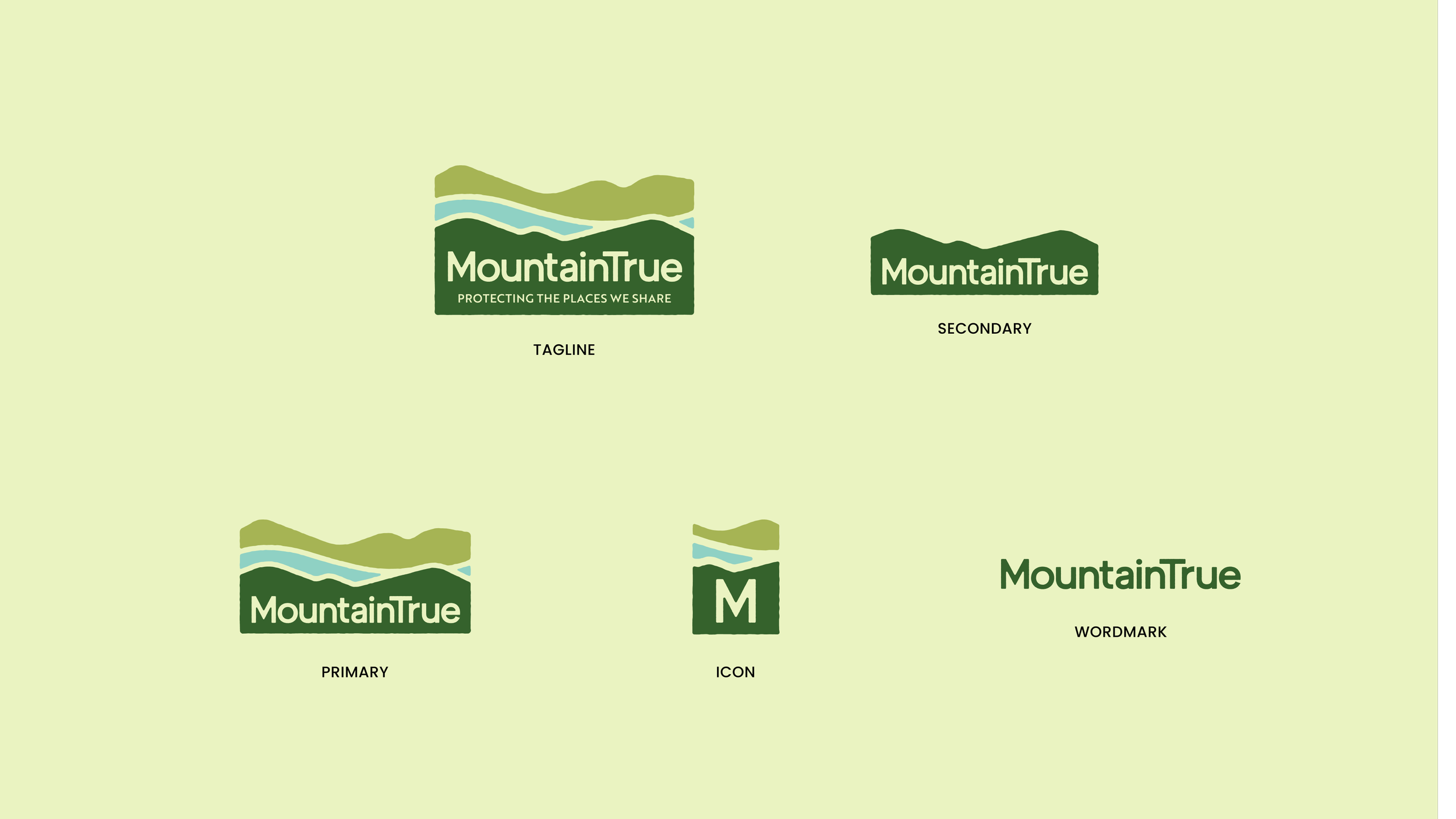
Logo
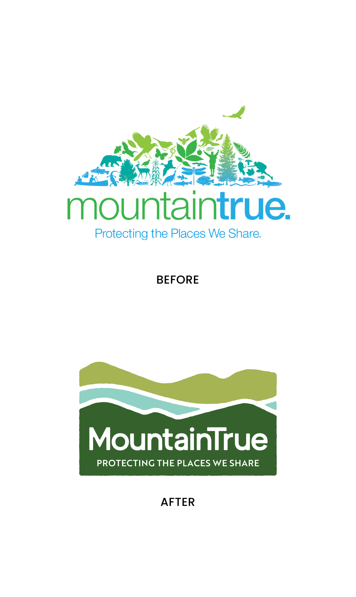
Our goal as we began our project with MountainTrue was to preserve the trust and brand equity they have built over the past 40 years, while making the brand feel more ownable and personal to volunteers, members, and other activists in the WNC community. Their previous brand kit consisted of Helvetica, a color palette of blues and greens, and a logo that was carrying too much of the brand and didn’t scale well.
The logo we developed keeps the mountain shape, nods to MountainTrue’s work with rivers, and uses a sans-serif typeface. Rough edges and a quirky “e” bring playfulness into the logo that is reflected in the rest of the brand kit. Activating the logo with animation (by our friend Kam at PWR Creative Studio) helps bring even more life into the brand for digital communications.
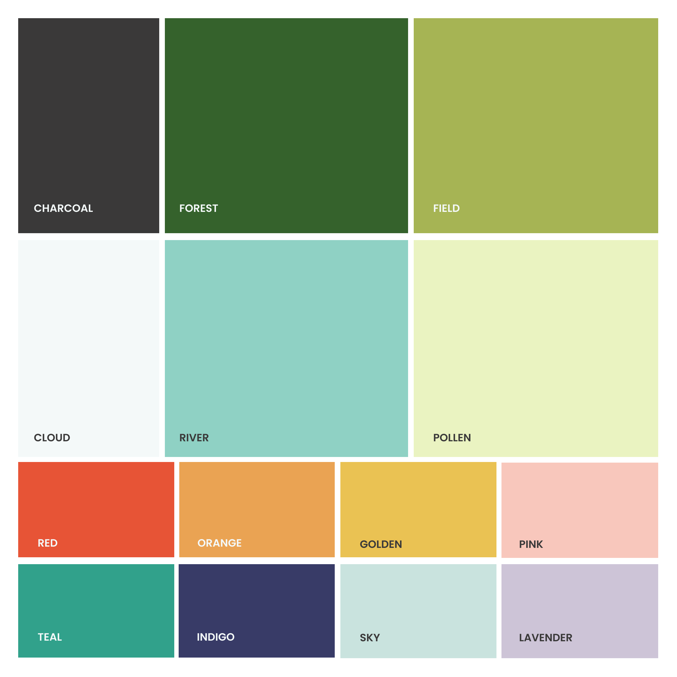
Type + Color
The core brand color palette has stayed similar to MountainTrue’s roots. We started with blues and greens, but toned them down from the existing palette to better reflect the natural environment that MountainTrue works in. We added in a rainbow of other tones to help communicate the vibrancy and
energy of MountainTrue and give them a bigger range of colors to use in various graphics. For typography, we chose a friendly serif for headlines and paired it with a rounded sans-serif.
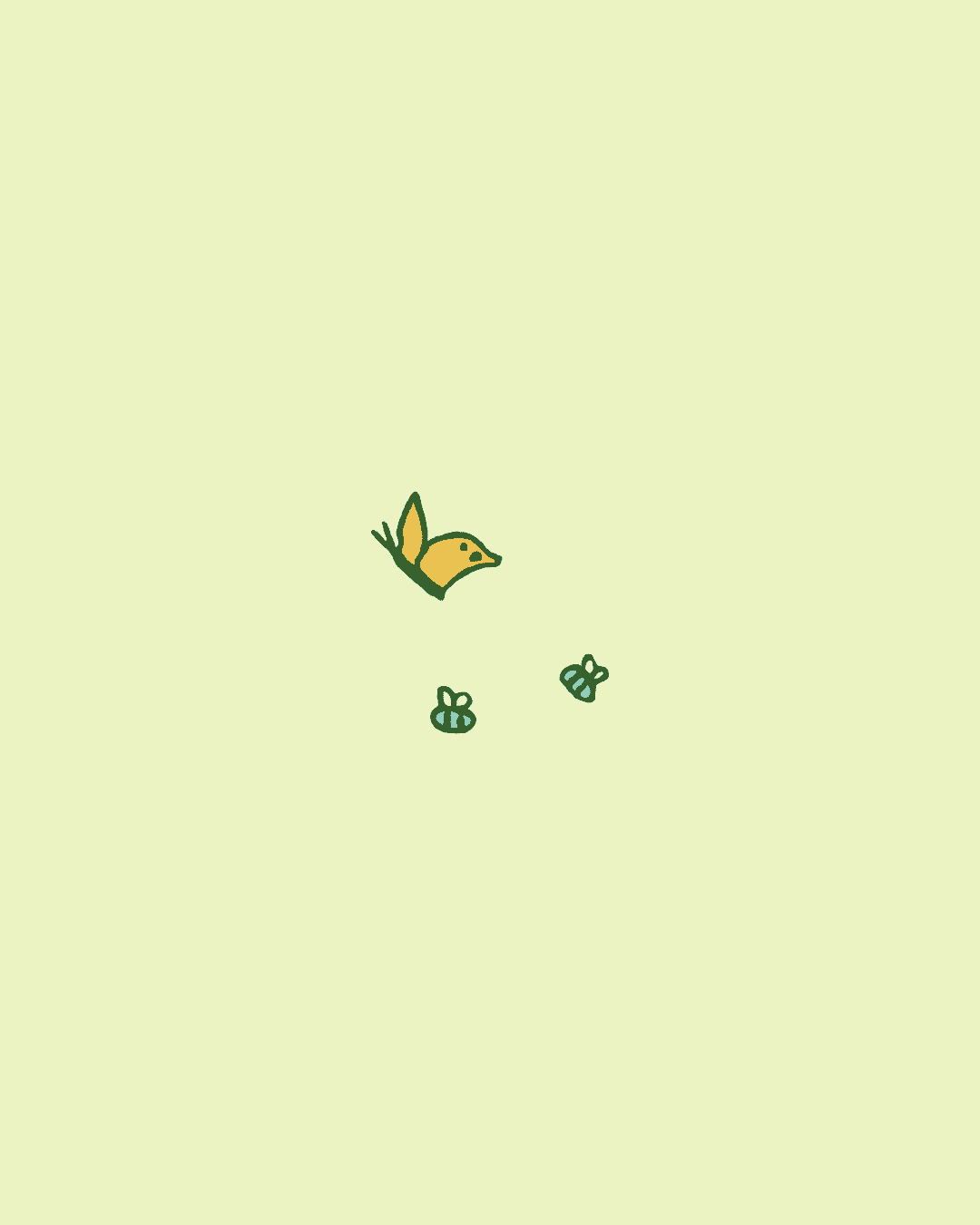
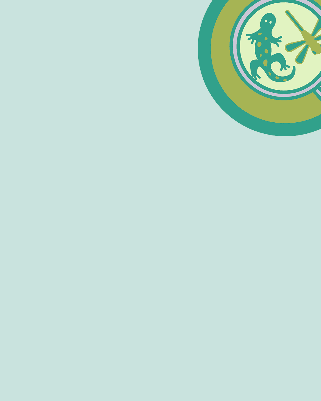
Charismatic Critters
All of the critter drawings we developed represent WNC native species, and they are all performing actions related to MountainTrue’s programs and main areas of focus.
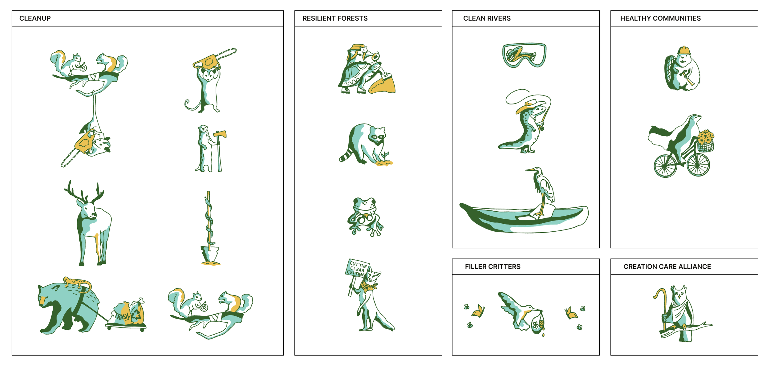
We really wanted volunteers, employees, and partners to see a glimpse of themselves in these little critter designs. Guidelines for the critters allow them to be quickly used in context with related programs or events.
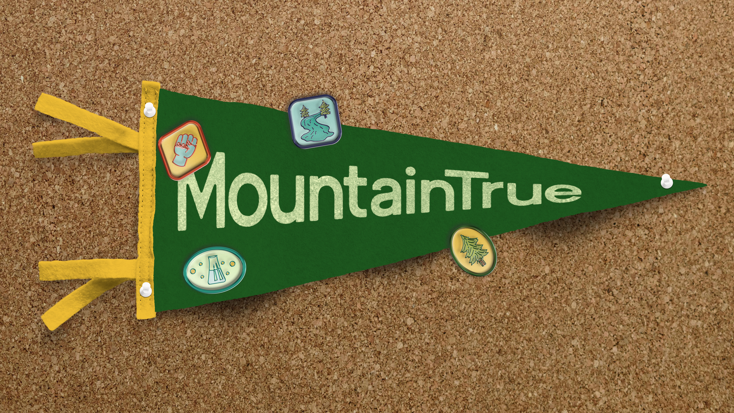
Achievement Badges
We brought in additional elements to make members and volunteers feel appreciated. We developed a badge style to highlight activities that participants complete, to further incentivize them to get involved with MountainTrue. Badges will be implemented digitally at first, but may eventually become a collectible item like
stickers, pins, or patches. We also created a pledge to show that being MountainTrue is even bigger than just being involved with the organization – it’s a commitment to our beautiful earth.

Mini Website
As we were finalizing the rebrand project, MountainTrue rolled out their Debris Cleanup Program. The program works to clean man-made debris from rivers in WNC. We worked with their marketing team to develop a simple six page website to facilitate involvement with this new program. The website focuses on 3 audiences – potential employees, volunteers, and landowners who need their rivers cleaned.
MountainTrue rolled out a series of ads via radio, print materials, and television to direct WNC residents to visit the site. They filled all of their paid positions within the first two months of the website launch, and continue to use the site to connect with volunteers and landowners.
Visit the site at www.cleanupwncrivers.com