Wake Refill
* Brand Identity } ILLUSTRATION
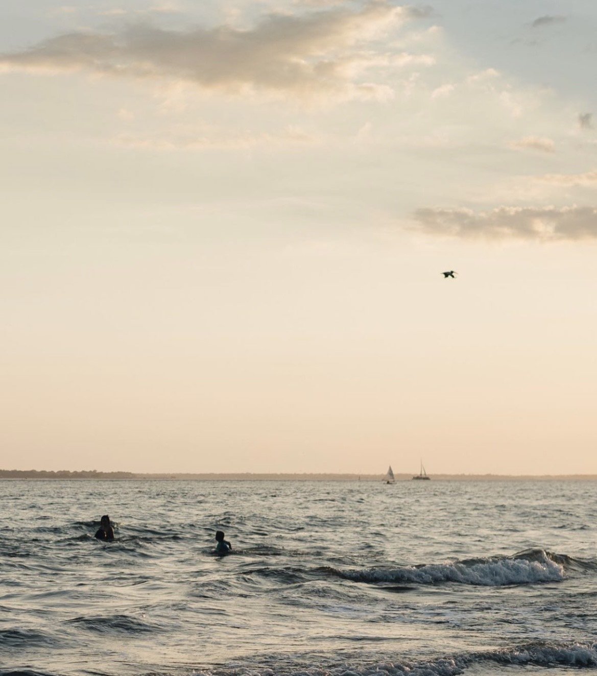
When Wake Refill reached out to us, they were after a brand that felt full of life and separate from the neutral aesthetic seen in the sustainability industry.
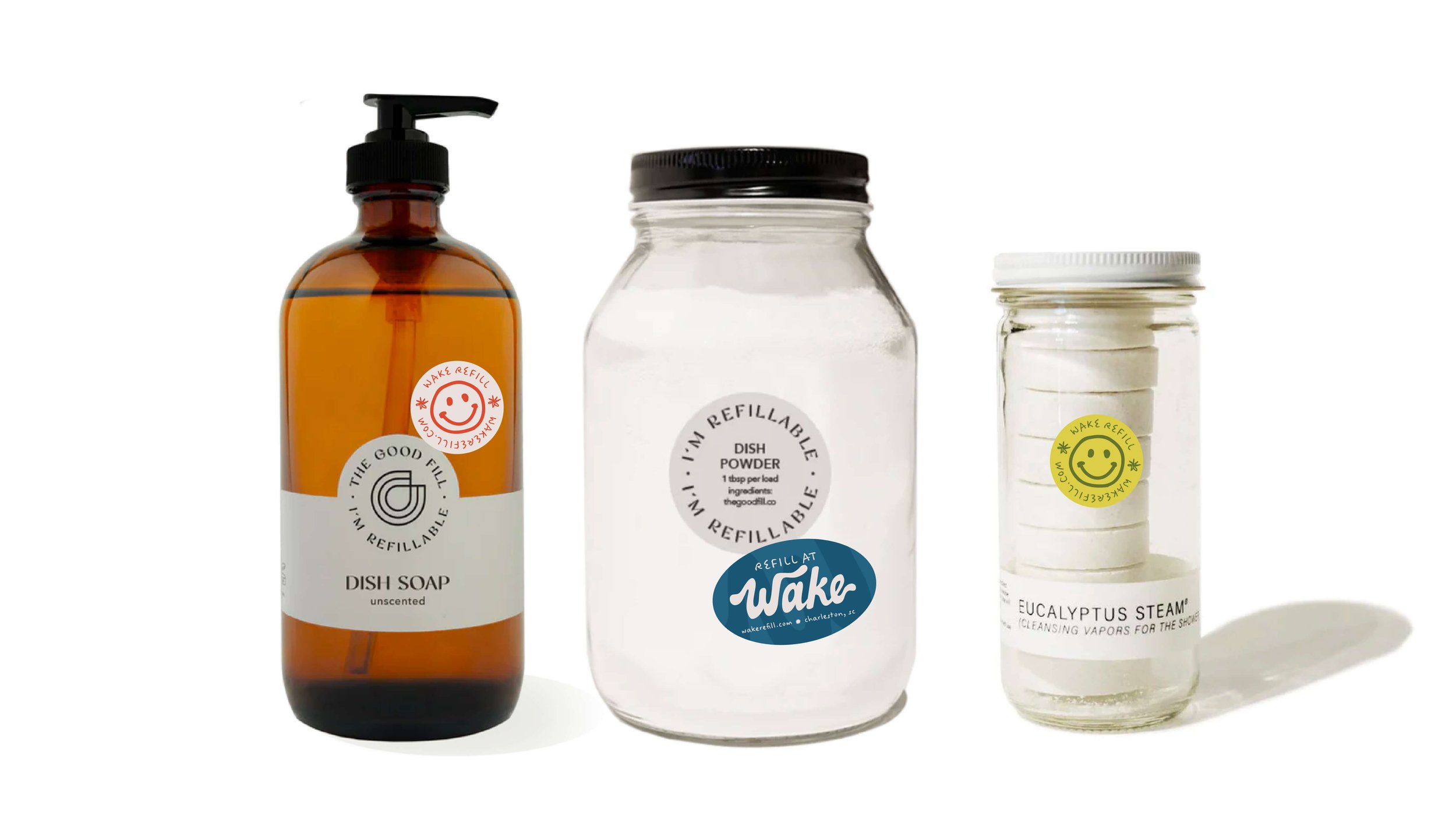
They envisioned Wake as a space where people could shop to reduce their environmental impact, but also come together and find a sense of community and connection.

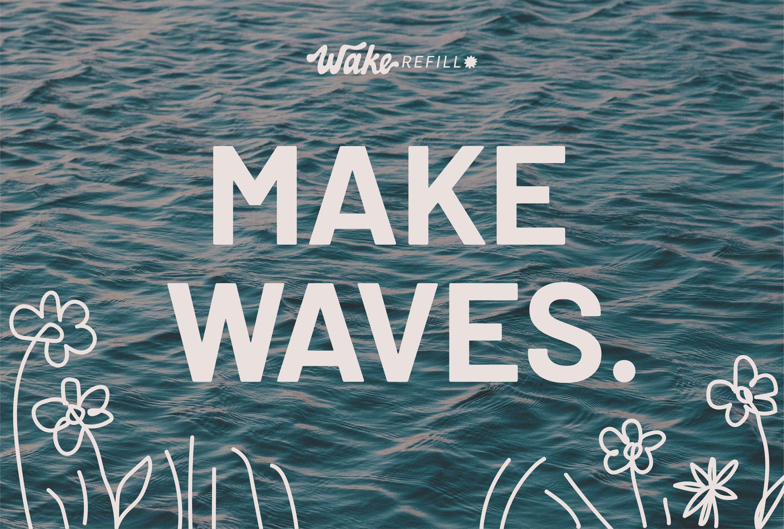
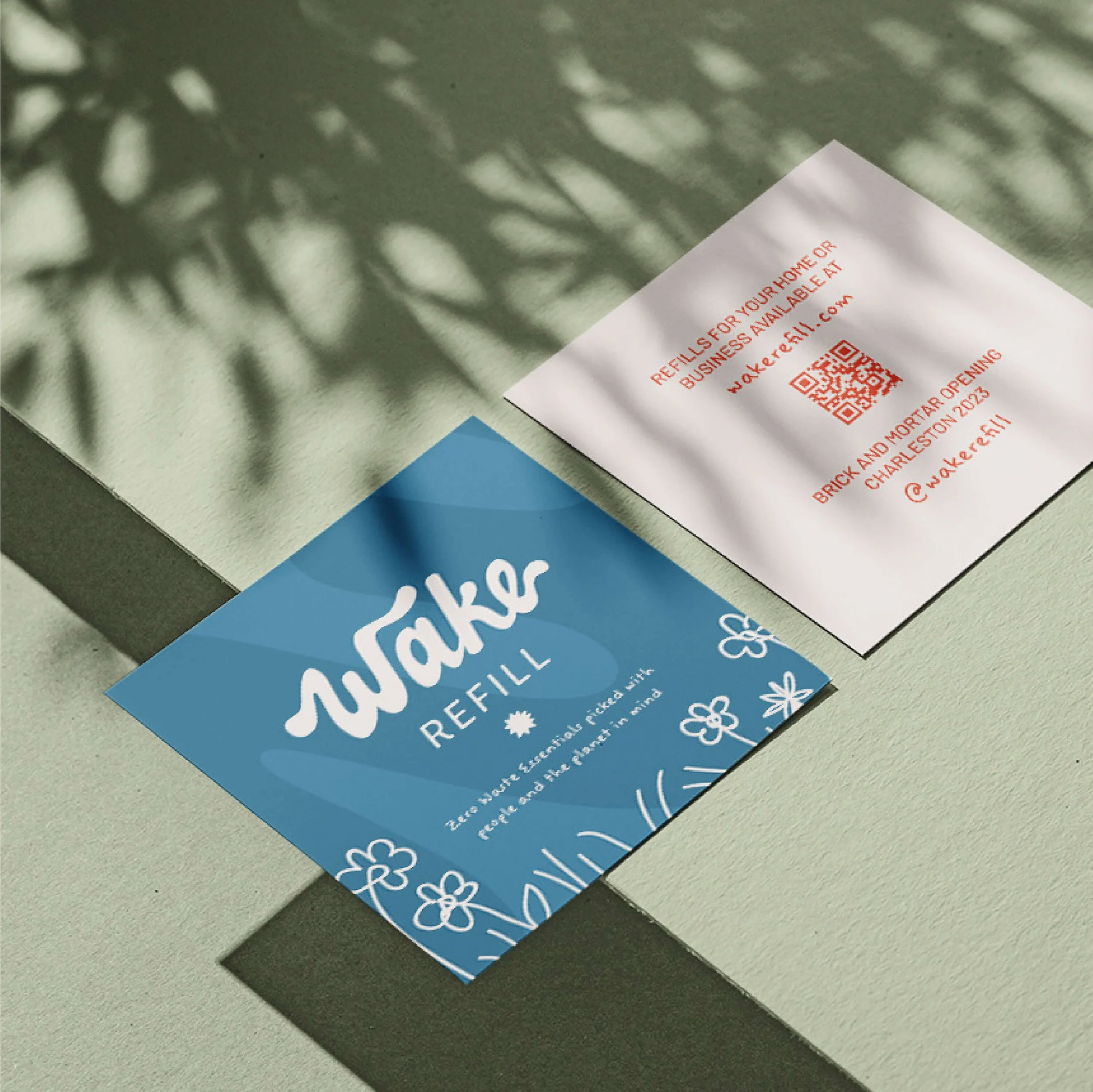
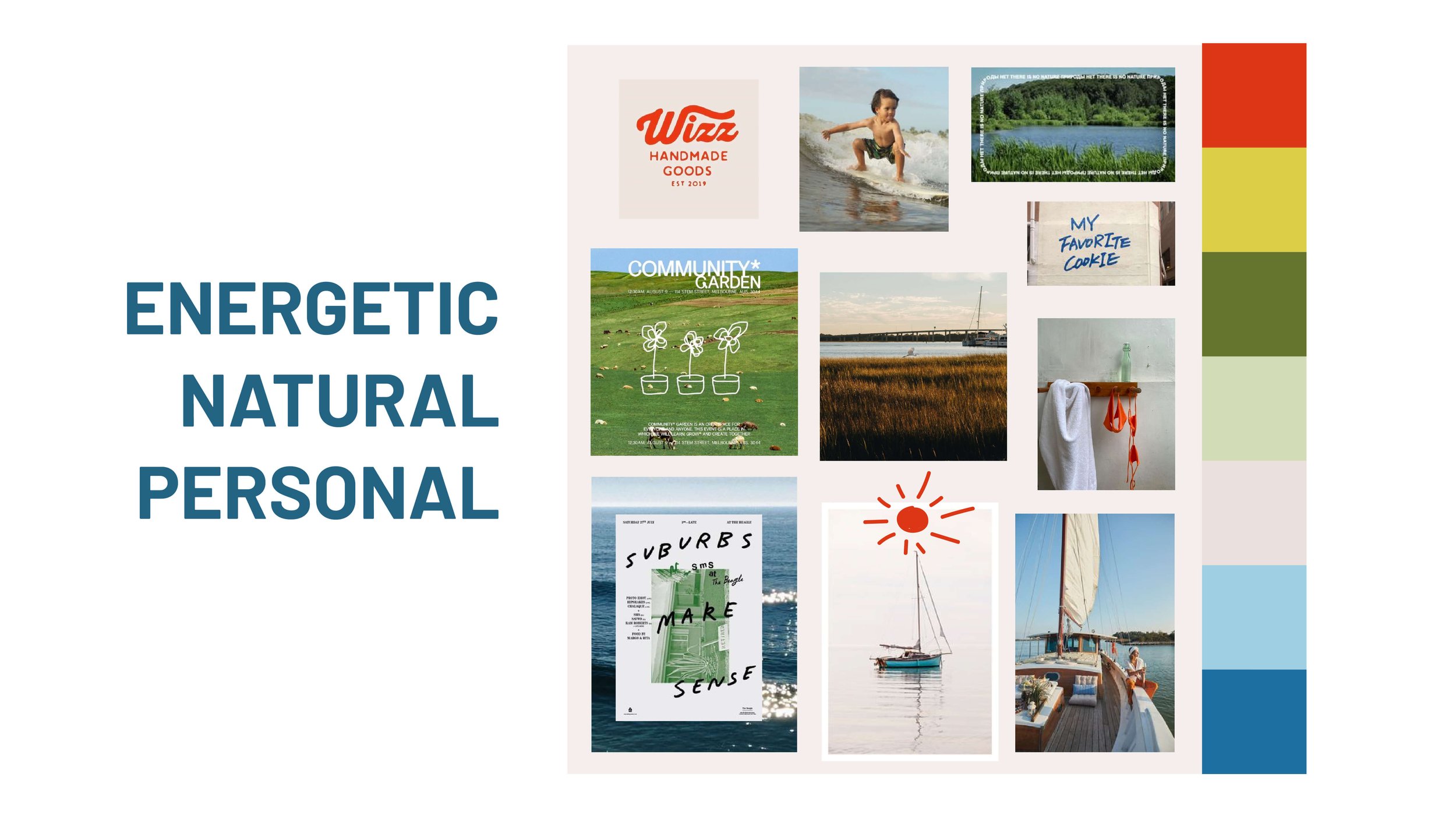
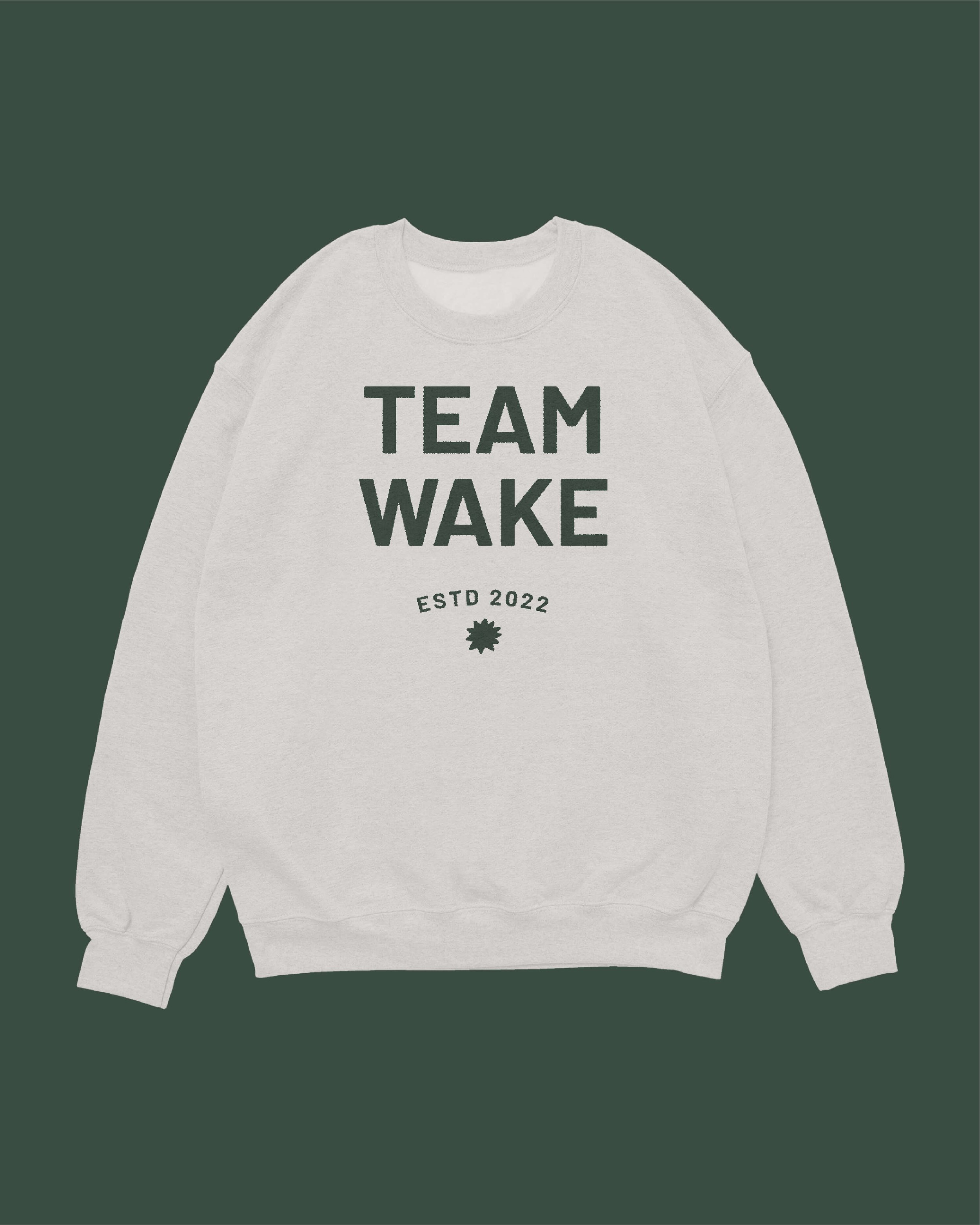
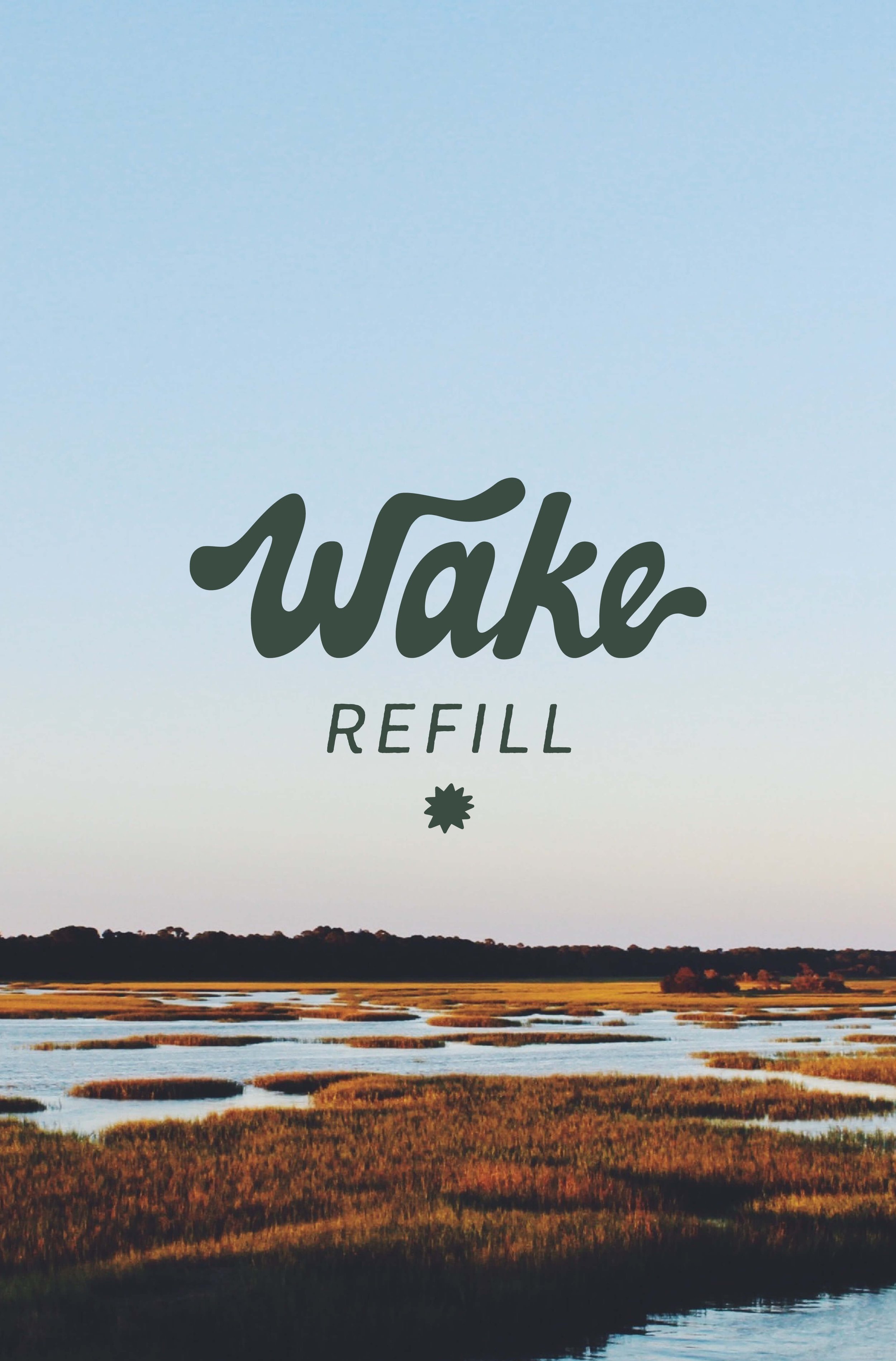
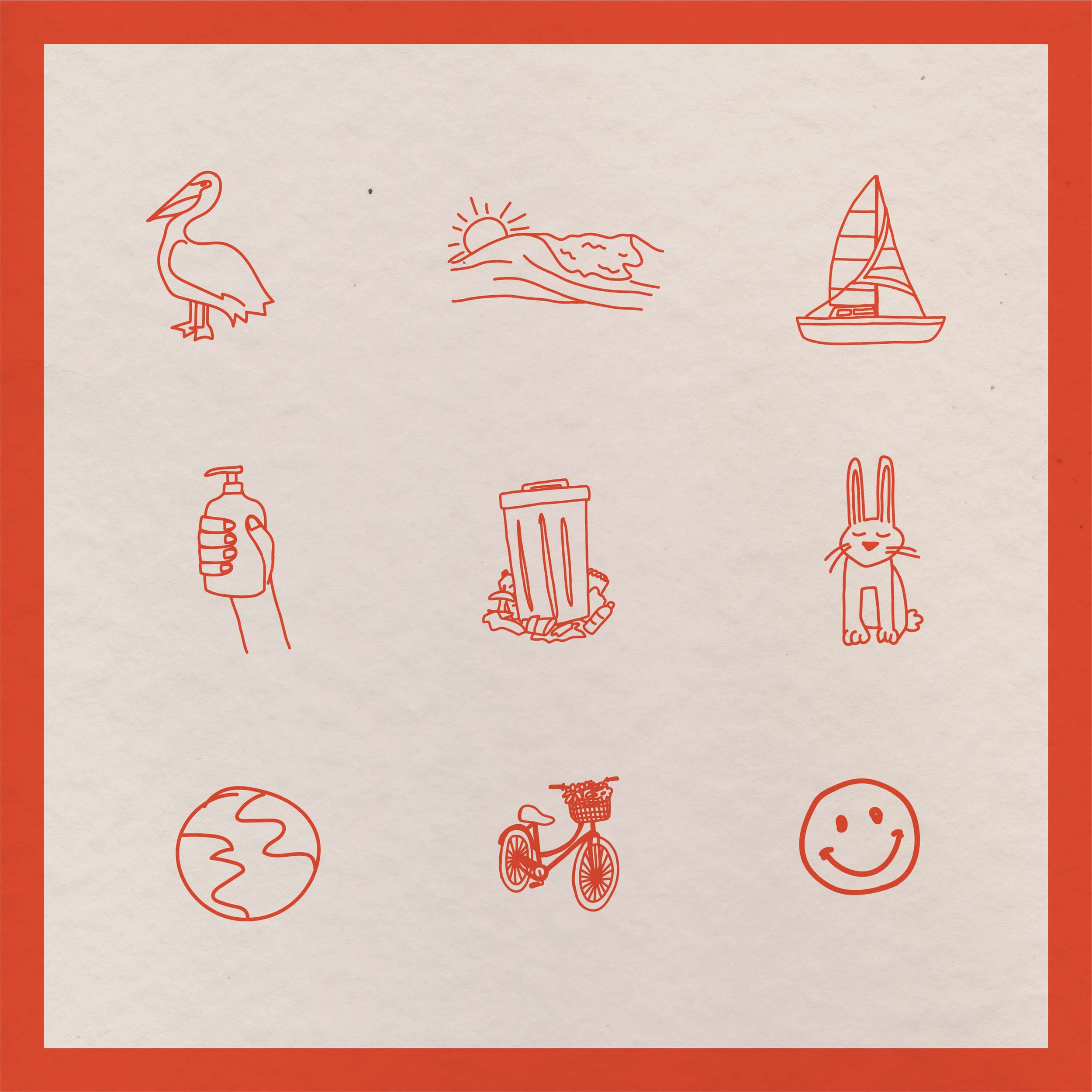
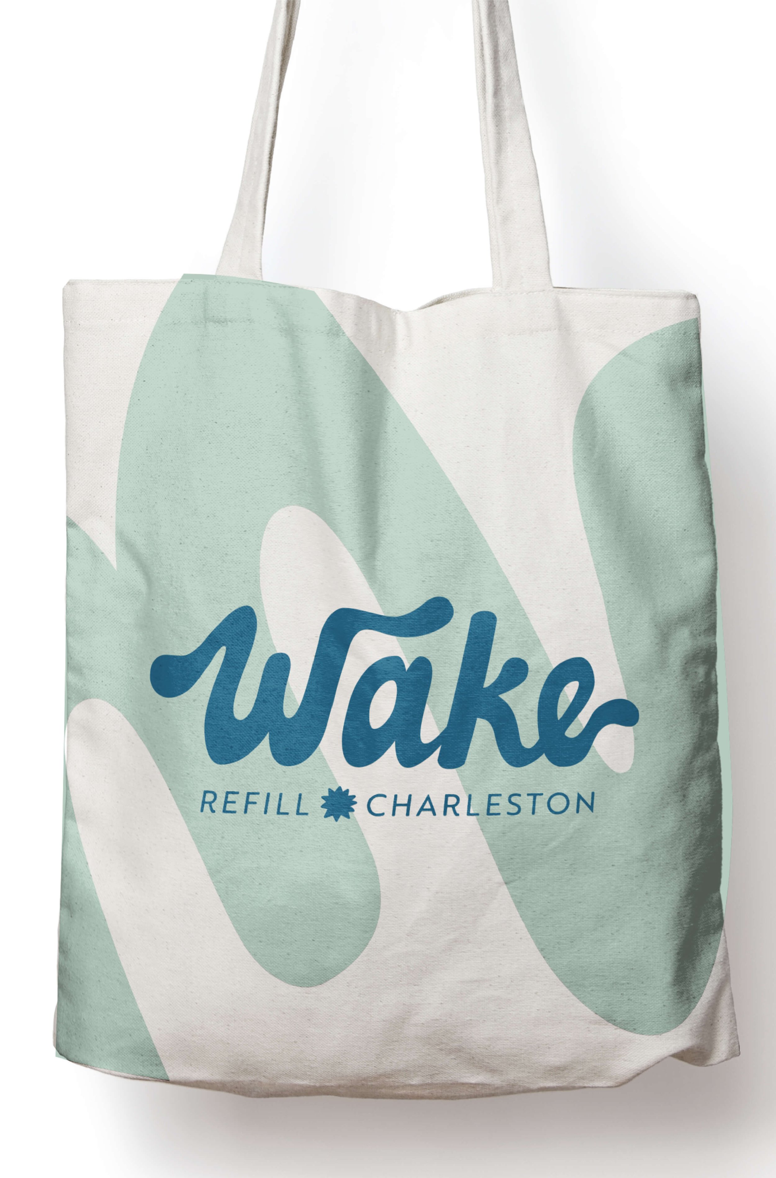
We built the brand around these ideas of life and human connection. For the color palette, we choose tones that were natural but not neutral. Blues from the ocean, greens from the marsh, and yellows and reds from vivid sunsets come together to create a palette that evokes nature but still brings energy and joy to the brand. Adding in handwritten elements and hand drawn icons makes the brand approachable and personal — and it is!
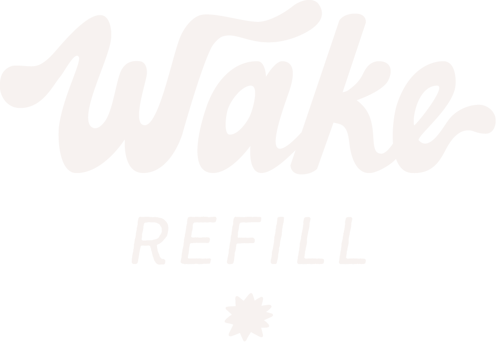
The brand is run by Hannah Jane and her husband, Grayson, and they fill every order by hand. The logo is also hand drawn, and uses a wavy script to keep the brand playful. The swoopy W and hand drawn sunburst are recognizable on their own and serve as the brand’s icon. Wake Refill has launched their online shop and is planning to launch their brick and mortar in Charleston later this year! If you are interested in shopping more sustainably, shop Wake here.